
Get in touch →
hello@julienicholls.design

Beaumont
Finding focus for a communications consultancy
• Brand concept
• Positioning
• Logo refresh
• Typography
• Colour palette
• Stationery
• Powerpoint templates
A fresh lens on an established brand
Beaumont have spent a decade helping organisations navigate complexity: building influence, answering tough questions, bringing clarity where there isn't any. After ten years, they knew the time had come to make sure their own brand reflected what they'd become.
Working directly with the two founders, I developed a brand refresh built around a single organising idea: the Beaumont lens. The circle that already sat at the heart of their logo became the concept. A moment of focus. A way of seeing what matters most. It gave the refresh a clear rationale and something genuinely ownable. A visual device that could work across every application, not just a new colour palette and a different font.
The new identity pairs a refined logo with a typeface that brings warmth and personality to the brand, a deliberate contrast to the more serious tone that professional services firms often default to.
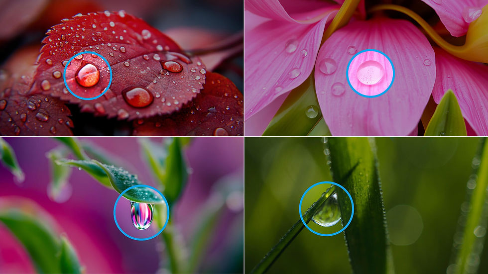
An extensive colour palette gives the team flexibility across different contexts and audiences, while the natural imagery system uses the lens device to draw focus to a single detail: resilience, clarity, connection, within each image.

✎ Brand imagery

The full suite of deliverables included stationery and a set of Powerpoint templates, giving the Beaumont team everything they need to present their thinking in a way that looks as considered as it is.
✎ Powerpoint templates

✎ Stationery

The outcome
A consultancy that helps others find clarity found a clearer sense of itself. The brand concept gave the refresh a coherence that goes beyond the visual. It's a way of talking about what Beaumont does as much as a way of showing it.
"We’re both so pleased with what you’ve managed to discern from the brief we sent over. Your proposal was clean, elegant and impactful. Well done."
Imogen Hitchcock, Founder, Beaumont

