top of page
Data visualisation infographic showing average caffeine amounts in different drinks including soft drinks, tea, instant coffee, matcha and coffee, used as the hero image for the infographic design service page by Julie Nicholls

Freelance

Infographic design

• Data visualisation
• Statistical graphics
• Maps and charts
• Patient information
• Campaign infographics
• Process and journey graphics

• Digital PR campaign graphics

Complex information, made compelling

Infographics are one of the most effective ways to make data and information land. Whether you need something shareable that earns coverage online, a clear explanation of a complex process, or editorial graphics that bring an article to life, the challenge is always the same: take something dense and make it feel effortless.

I've been creating infographics for agencies and direct clients for over nine years, across subjects ranging from global property prices to NHS patient journeys to board game arguments. No two briefs are the same and that's exactly how I like it.

Infographics showing to 5 reasons the world wants to move to Japan

Campaign graphics

Made to be shared

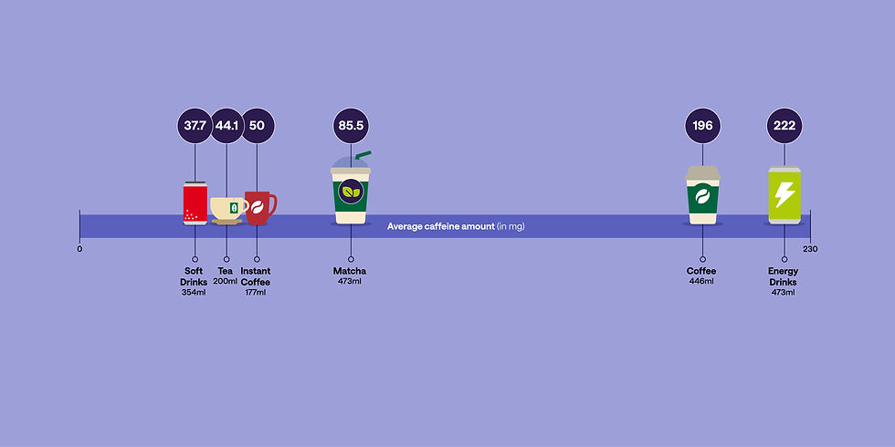
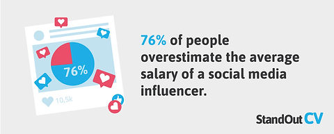
A lot of the infographics I produce are created to support articles, press releases and brand content, designed to be visually striking enough to get noticed, picked up and shared online. The brief is always to make the data the story: take the most interesting angle, bring it to life visually, and make it easy to engage with at a glance.

I work with several agencies on this kind of project and love the variety it brings. I never quite know what's going to land in my inbox next, which keeps it interesting.

Infographic showing the top five reasons the world wants to move to Canada, created for Remitly by Julie Nicholls on behalf of a digital PR agency
Infographic showing the top five reasons the world wants to move to the United Kingdom, created for Remitly by Julie Nicholls on behalf of a digital PR agency
Infographic showing the top five reasons the world wants to move to Australia, created for Remitly by Julie Nicholls on behalf of a digital PR agency

"Thank you for all your work on these, we were super happy and so is the client!"
Tonje Ødegård, Digital PR Director

Infographic showing the percentage of an average home that people in Wollongong Australia can afford on their salary, created by Julie Nicholls on behalf of a digital PR agency
Infographic showing the percentage of an average home that people in San Francisco can afford on their salary, created by Julie Nicholls on behalf of a digital PR agency
Infographic showing the percentage of an average home that people in Paris can afford on their salary, created by Julie Nicholls on behalf of a digital PR agency
Infographic showing the percentage of an average home that people in Vancouver can afford on their salary, created by Julie Nicholls on behalf of a digital PR agency
Illustrated infographic showing statistics about lazy holidays at all inclusive resorts, created by Julie Nicholls on behalf of a digital PR agency
Illustrated infographic showing statistics about food and drink at all inclusive holiday resorts, created by Julie Nicholls on behalf of a digital PR agency
Illustrated infographic showing alcohol consumption statistics at all inclusive holiday resorts, created by Julie Nicholls on behalf of a digital PR agency
Illustrated infographic showing statistics about baggage compensation and travel insurance claims, created by Julie Nicholls on behalf of Root Digital
Infographic showing packing tips and how to pack a backpack for travel efficiently, created for Carl Friedrik by Julie Nicholls on behalf of Root Digital
Map infographic showing which car brands are considered least cool around the world, created for MoneySupermarket by Julie Nicholls on behalf of a digital PR agency
Illustrated infographic showing statistics about holiday overpacking habits and travel mindset, created for APH by Julie Nicholls on behalf of Root Digital
Illustrated stats on the holiday mindset
Illustrated infographic showing statistics about holiday mood and the psychology of travel, created for APH by Julie Nicholls on behalf of Root Digital
Illustrated infographic showing statistics about the world's friendliest airports, created for APH by Julie Nicholls on behalf of Root Digital
Infographic from a travel booking report showing the average timeline and calendar for planning and booking a trip, created by Julie Nicholls on behalf of Root Digital

"These are brilliant, thank you.The calendar one in particular is fantastic."
Becca Bennett, Senior Content Marketing Manager

Infographic showing which board games cause the most arguments, created for Poggers by Julie Nicholls on behalf of Root Digital

"It's so nice working with you and seeing what you come up with. I'm always amazed by your speed!"
Alice Gee, Digital PR agency

Infographic showing public opinion on what the Royal Family should really earn, created for Standout CV by Julie Nicholls on behalf of Root Digital
Infographic showing public opinion on what the Prime Minister should really earn, created for Standout CV by Julie Nicholls on behalf of Root Digital
Infographic showing public opinion on what doctors should really earn, created for Standout CV by Julie Nicholls on behalf of Root Digital
Infographic showing public opinion on what social media influencers should really earn, created for Standout CV by Julie Nicholls on behalf of Root Digital
Infographic showing public opinion on what nurses should really earn, created for Standout CV by Julie Nicholls on behalf of Root Digital
Infographic showing public opinion on what professional footballers should really earn, created for Standout CV by Julie Nicholls on behalf of Root Digital

ALFED aluminium industry Infographic showing key statistics and data for the aluminium industry, created by Julie Nicholls

NHS London hospitals challenges Infographic highlighting the key challenges faced by London hospitals and the NHS in the capital, created by Julie Nicholls

Homecure toilet roll Infographic showing how much toilet roll the average person uses over a lifetime, created for Homecure Plumbers by Julie Nicholls on behalf of Root Digital

Premium food delivery costs Infographic showing the comparative costs of premium food delivery services, created by Julie Nicholls on behalf of Root Digital

Thrift store hygiene Infographic showing hygiene statistics and considerations when buying items from thrift stores and charity shops, created by Julie Nicholls on behalf of Root Digital

OneLondon London Care Record usage Inf
Infographic showing the comparative costs of premium food delivery services, created by Julie Nicholls on behalf of Root Digital
Infographic showing hygiene statistics and considerations when buying items from thrift stores and charity shops, created by Julie Nicholls on behalf of Root Digital
Infographic showing statistics about Google search trends for head lice treatments across the UK, created by Julie Nicholls on behalf of Root Digital
Infographics showing gid economy statistices for the U.S.
, created by Julie Nicholls on behalf of Root Digital

Editorial illustration

Data with personality

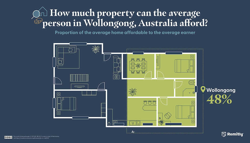
Some infographic projects go deeper than a single graphic. For one US financial brand I've produced an ongoing series of illustrated articles combining hero images, data graphics and infographics, all created to work within their brand system and designed to be shared across social platforms.

Each piece translates a financial or personal finance topic into something approachable, clear and visually engaging. The subjects range from first-time buyer costs to Black Friday regrets to the true cost of Thanksgiving dinner.

Illustration and infographics created for an article on debt-to-income ratios for mortgage applications in the US

"You perfectly understand what we need for data visualisations Julie, always thankful for your work."
George Driscoll, Root Digital

Illustrated infographic showing the individual costs of Thanksgiving dinner items including turkey, pumpkin, pie and side dishes with price labels, created for Self by Julie Nicholls
Illustrations created for a series of articles exploring money & debt in the US

Public sector and NHS information design

Clarity where it matters most

Public sector infographics have a different set of demands. Accessibility, plain English, and the ability to communicate complex processes to a wide range of audiences are all non-negotiable. I've worked with several NHS programmes and public sector organisations to produce infographics that explain patient journeys, programme outcomes, statistics and service information.

This work requires a different kind of thinking to a campaign graphic. Less about visual impact, more about genuine clarity. Getting it right matters because the people reading it are often making decisions about their own health or care.

Infographic showing the step by step patient journey for hip or knee replacement surgery at NCL Orthopaedic Network, created by Julie Nicholls
Infographic showing key statistics from the OneLondon 2024 highlights report including London Care Record views and Universal Care Plan usage data, created by Julie Nicholls

Data visualisation and charts

The unglamorous but essential bit

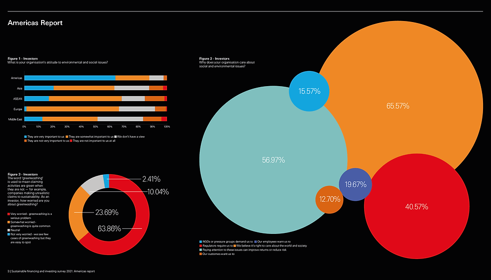
Not every infographic is a colourful illustration. Sometimes a client just needs all the charts and graphs in a report to look consistent, clear and properly on brand. It requires real precision, accurate data representation, clear labelling, consistent styling and the kind of attention to detail that stops a board presentation looking like it was put together by three different people.

I produce charts, graphs, tables and timelines for reports and presentations across a range of sectors. If you have a report full of spreadsheet data that needs turning into something a reader can actually understand, I can help.

Page from a sustainable financing and investing survey report showing data visualisation and infographic design by Julie Nicholls on behalf of Mango Design
Further page from a sustainable financing and investing survey report showing charts and data panels designed by Julie Nicholls on behalf of Mango Design
Infographic showing key statistics and data for the aluminium industry, created by Julie Nicholls
Infographic highlighting the key challenges faced by London hospitals and the NHS in the capital, created by Julie Nicholls

Services

Come to me for one thing
and stay for everything else

Got an infographic project in mind?

Whether you have data that needs visualising or a process that needs explaining, I'd love to hear from you.

Logo made up of JN initials

I’m Julie Nicholls, a freelance designer based in Essex, UK. I work remotely for design, digital and media agencies whenever they need a little extra support. I also work directly with all kinds of businesses to help them connect with their audiences through good design. Let's chat about how I can help your business.

bottom of page